
Earl and I sat down with Jordan Hagedorn to talk about the process of creating trading cards from our time with Fleer. It is always fun talking with Jordan, he has a real passion for collecting. Enjoy!
arenadesign
I was lucky enough to sit down with Josh on his YouTube channel Cardboard Chronicles. We talked about a lot of the trading card sets that we worked on back in the 90’s. It was great reminiscing about what it took to get some of those sets produced. Hope you enjoy it.
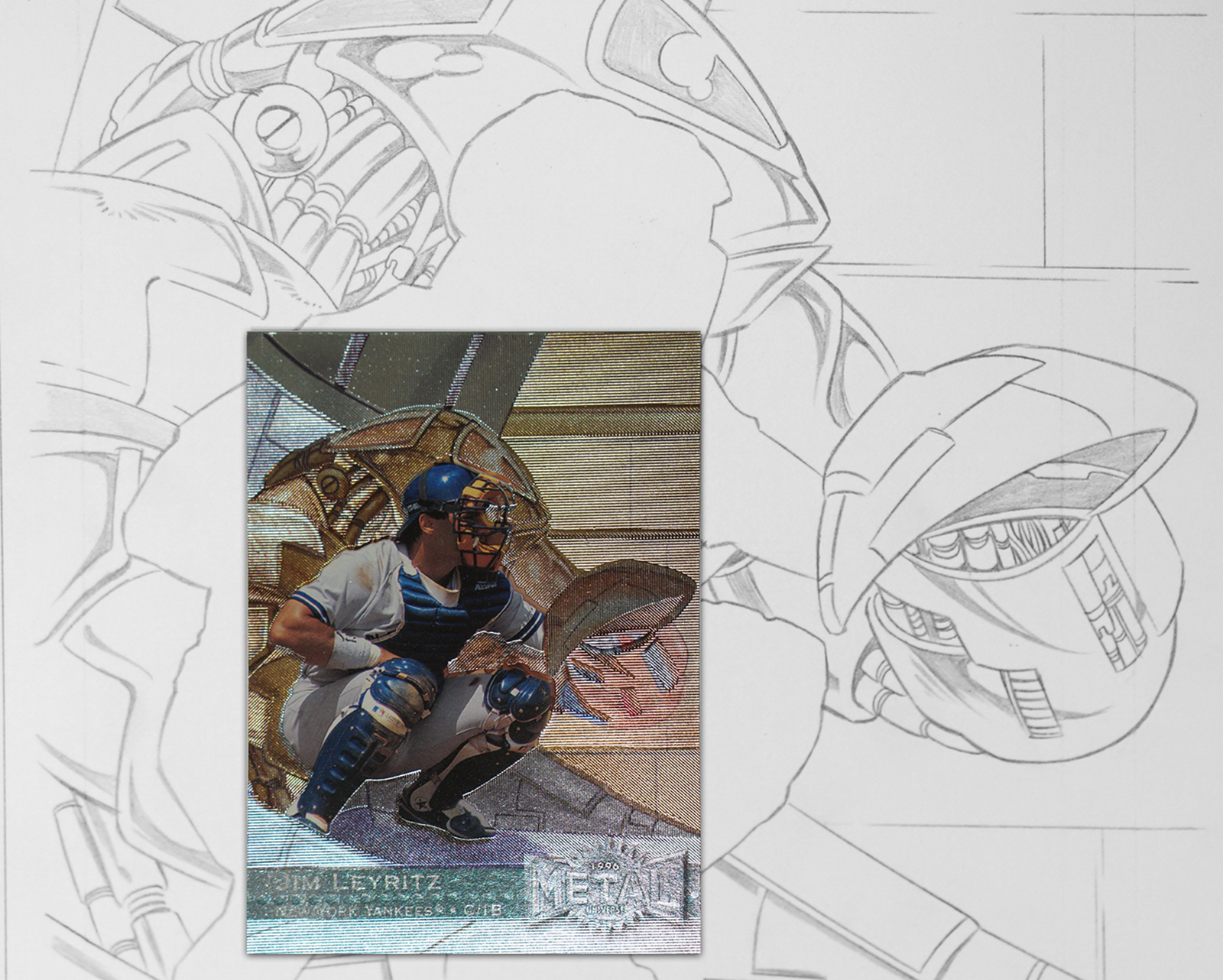
The transformation from sports hero to super hero had its beginnings back in 1992. That is the year Marvel Entertainment purchased Fleer Tradings Cards. So when it came time to design the 1996 Metal Universe set of Baseball cards, it seemed like a natural fit to utilize some of the talented illustrators we now had an alliance with. We already had brands with a more traditional look like Fleer, Ultra, Flair, etc… This was an opportunity to try something different and create cards that took the player out of their natural settings (on the field or on the court) and put them in more of a “super hero” situation.
I started by isolating the player from the background and sent them off to some of the Marvel Comic artists. What I received back were concepts that I found exciting and dynamic and I knew there would be a certain card collector that would feel the same way. The original sketches were turned into digital color art that was used for final card production. With the set being named “Metal” I knew that foils stamping would play a part on the final card. The background art was sent to the die maker where they were etched to enhance the artwork for each individual card. Not an easy feat since there were 247 cards in the set. For the basic card the foil was over printed with the art but for the Platinum parallel cards, what you see is just the etched foil.
I am satisfied knowing the set has withstood the test of time. It has become more and more collectible as time goes by, especially the NBA version which had the Precious Metal Gems added. That set and parallel deserves its own post, which I will write in the near future. If you are a card collector, I hope you have enjoyed them. If you are not a card collector, check them out and enjoy some of the images here of the original sketches for the set.
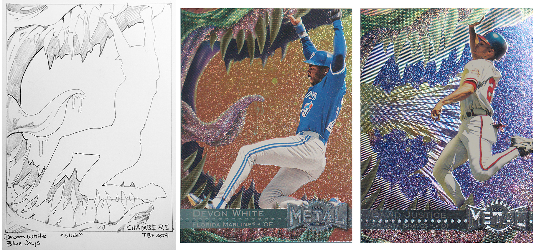
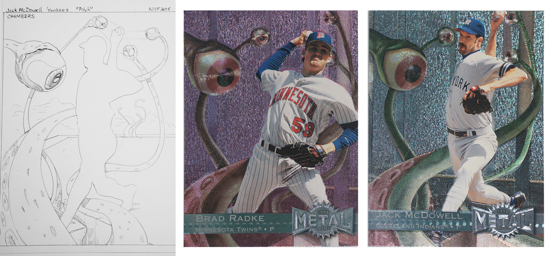
In the set each illustration was used for two players that would be in a similar position. In the case of these four cards, the illustrator went a step further and made some changes to the art to make each player slightly different. Usually the same art was used but this shows a nice variation.
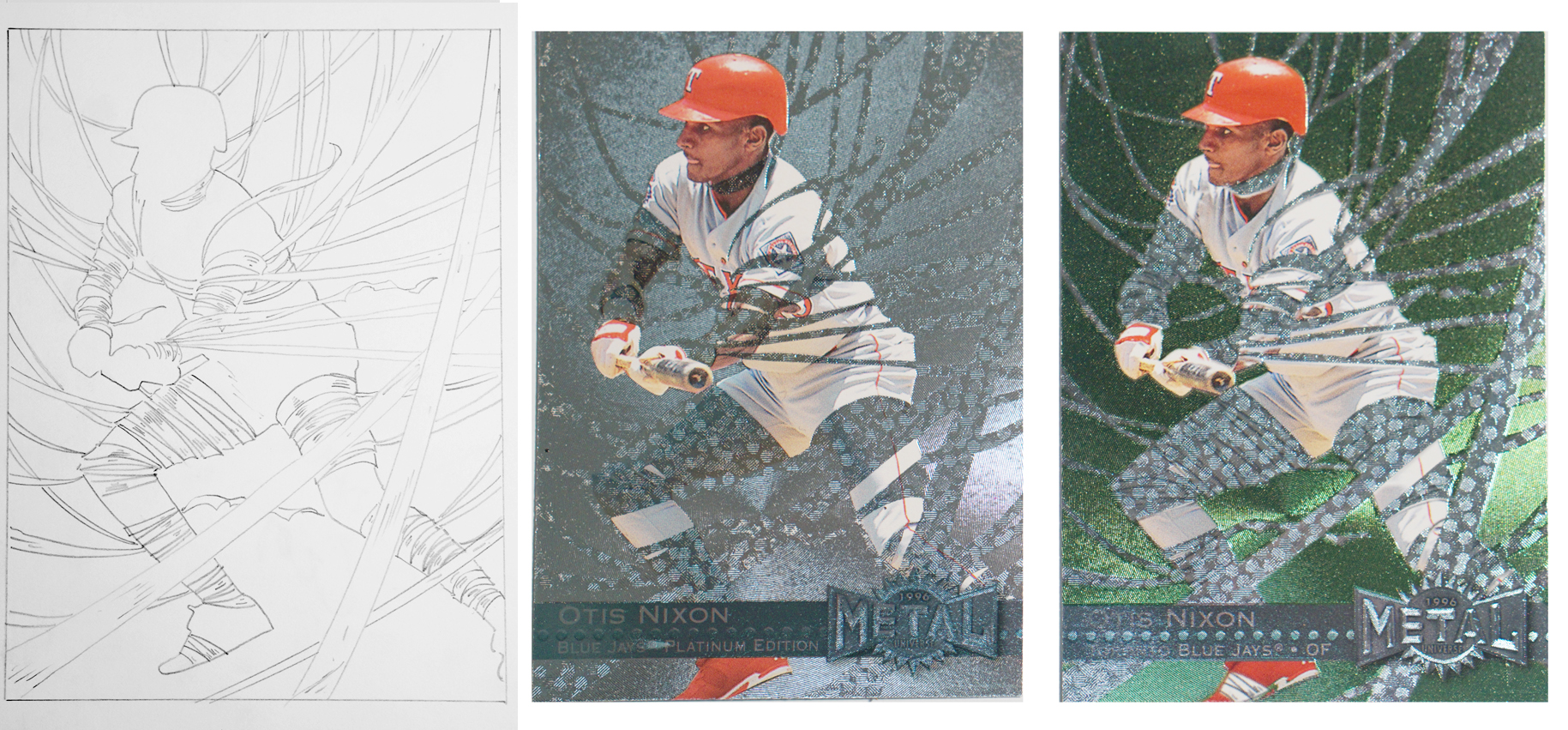
This shows the original sketch, then the Platinum parallel version without the color over the background, and finally the basic card. In this you can see how the foil dies were etched to the illustration so that you can still see the art even without the illustration printed over top.
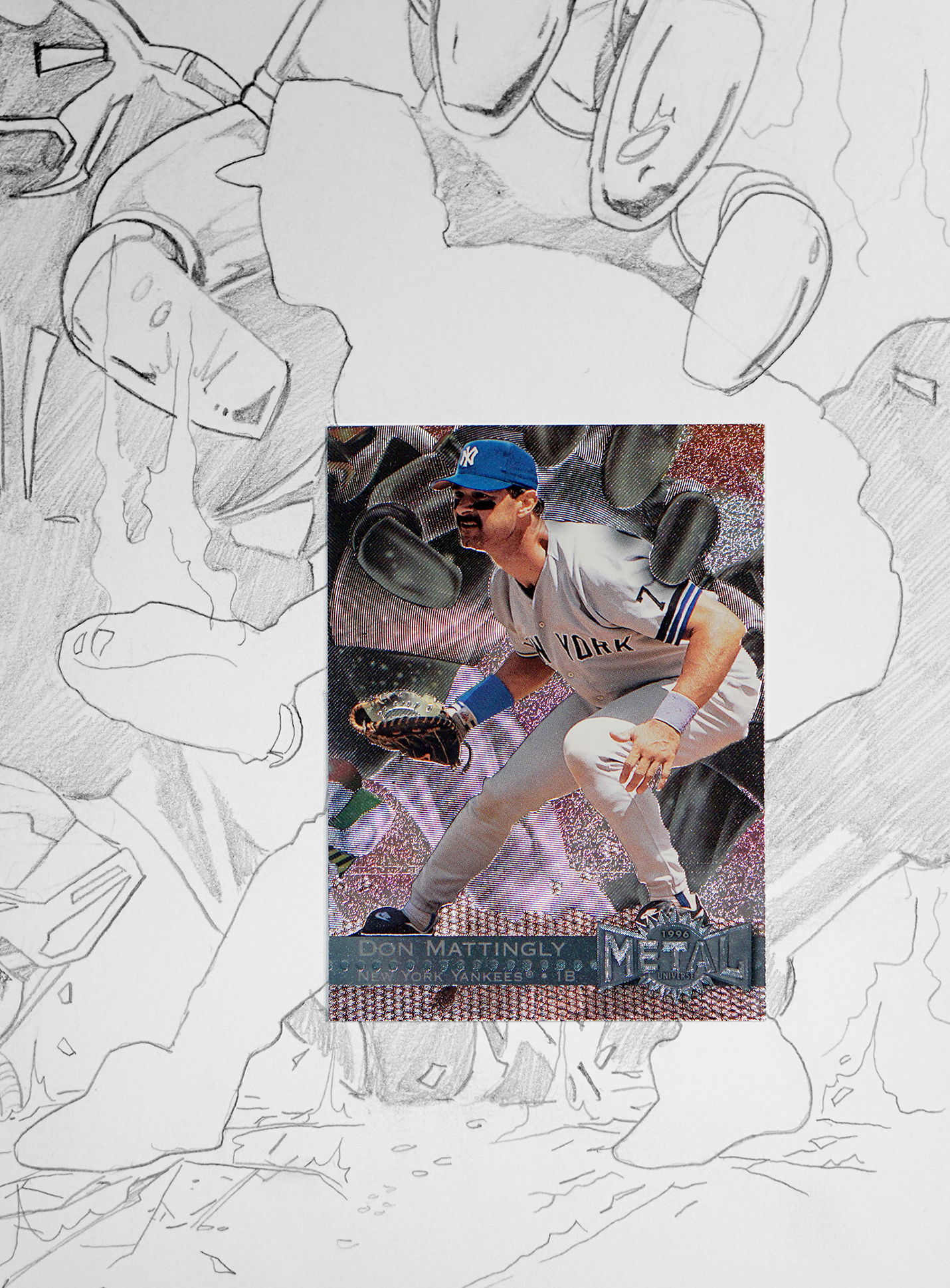
Here you can see the final card over top of the original sketch. This should give you an idea of the size at which the sketches were created.
Check out this new video we made in Keynote showing some of our work. Hope you enjoy!
This is one of my favorite quotes. Henry Ford was able to put his finger on exactly how some people think. He was a visionary, not looking at what is current but looking to the future. In order to be in design we need to think like Henry Ford. When you give people something great, that becomes the new benchmark. Instead of giving them a “faster horse” you give them the Model T.
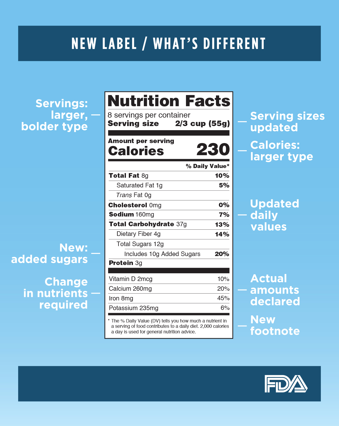
On May 20th 2016, The FDA and Michelle Obama unveiled changes to the Nutrition Facts box that is found on all food packaging sold in the United States. They are the most significant changes since the Nutrition Labeling and Education Act (NLEA) was passed in 1990, requiring all packaged food to bear the standardized nutrition label and ingredient panel. The changes reflect new Scientific data on nutrition especially as it relates to sugar consumption.
The changes in a nutshell.
While the new label may look like the old one there are significant changes which the FDA feels will help consumers be better informed when making decisions about the nutritional value of the foods they purchase and consume.
The “iconic” look of the label remains, but we are making important updates to ensure consumers have access to the information they need to make informed decisions about the foods they eat. – FDA
One of the most noticeable changes is the bolding and increase in the font size for Calories and Serving Size, emphasizing the information and making it stand out. The serving size is now based on what consumers actually drink or eat instead of what they should be drinking or eating. For example, in a liter of soda, a serving size used to be 8 ounces and is now 12 ounces. Since people usually consume anything that is between one and two servings (like a 20 ounce soda) as one serving, the calories and other nutrients will be labeled as one serving in that instance. Also, there is now a “dual column” label that will be used if a product is larger than one serving but may be consumed as one serving, such as a 24 ounce soda. The consumer will then easily be able to see the one serving calorie and nutritional information as well as the entire package information.
There are some nutrients that are required that were not previously required such as Vitamin D and potassium, and some that have been dropped, but the main change to the content is in the new “added sugars”. This change is based on new scientific data that shows if you your daily calories are more than 10% sugars, it is hard to meet your nutrient needs and stay within your calorie limits. This number shows the amount of sugar that has been added verses the amount of sugars that naturally occur in some foods such as fruit.
Most manufacturers will need to be in compliance with the new labeling by July 26, 1918 but if you have less than $10 million in annual food sales you will have an extra year to comply.
If you and your team need help executing these new changes, give Arena Design a call. We will help guide you through the process.
![]()
We were pleased to be interviewed by SB Nation on our years designing trading cards for Fleer. Click on the link to read the entire article at sbnation.com. It was great reflecting on the diverse technologies we were able to explore while working on these iconic cards. The best thing about designing something like a baseball card is that they are cherished. Collectors hold on to them for their entire lives weather they have monetary value, which many do, or not. It is a rare occasion that a designer gets to work on a project with such longevity.
Recent Comments